
Mobile-first web design is defined as the practice of designing websites starting from the smallest screen sizes, typically 320–375px wide, before scaling up to tablets and desktops. Mobile traffic exceeds 60% globally, and Google indexes primarily mobile versions of sites for ranking. That combination makes mobile-first the most direct path to better SEO and stronger user experience. The approach relies on three core techniques: progressive enhancement, content prioritization, and CSS media queries using min-width. For web designers and small business owners, understanding these principles is no longer optional.
What is mobile-first web design and why does it matter?
Mobile-first web design is a progressive enhancement strategy that builds a lean, functional baseline for the smallest devices first, then layers in complexity as the viewport grows. The term was popularized by designer Luke Wroblewski in 2009, but the underlying logic has only grown more relevant as mobile usage has expanded. Starting small forces every design decision to earn its place on screen.
The SEO case is direct. Google's mobile-first indexing means the mobile version of your site is what Google crawls and ranks. If your mobile layout hides content, loads slowly, or breaks on a 375px screen, your search rankings suffer regardless of how polished the desktop version looks. That is a business problem, not just a design preference.

The user experience case is equally strong. Poor mobile experiences drive bounce rates up and reduce engagement across the board. Users on mobile expect speed and clarity. A site that delivers both on a small screen will perform even better on a large one.
What are the core principles of mobile-first web design?
The foundation of mobile-first design rests on five principles that work together.
- Content prioritization. Designing for small screens forces you to remove non-essential elements that clutter the interface. Only the most important content survives. That discipline produces cleaner, more intuitive layouts on every device.
- Progressive enhancement. Start with a functional mobile baseline, then add features for larger screens. This is the opposite of the older "graceful degradation" model, which started with a full desktop site and stripped it down.
- CSS
min-widthmedia queries. Mobile-first CSS usesmin-widthbreakpoints to add styles as screens get larger, rather than overriding desktop styles for smaller screens. This keeps the mobile stylesheet lean and fast. - Touch-friendly targets. Minimum touch target size is 44x44px per established interface guidelines. Smaller targets cause accidental taps and user frustration, which directly increases abandonment.
- Performance as a design constraint. Compressed images, deferred scripts, and minimal CSS are not afterthoughts. On mobile, they are requirements. A fast-loading mobile site also ranks better in search.
Pro Tip: Sketch your layout at 375px width before opening any design tool. If the layout does not work at that size, it is not ready for any size.
Mobile-first is not a layout trick. It is a content strategy and a performance strategy packaged as a design workflow.
What are the benefits of adopting a mobile-first design approach?
The practical advantages of mobile-first design show up in performance, search rankings, and conversion rates. Here are the six most significant benefits.
- Better user experience on the most-used devices. Most of your visitors arrive on a phone. Designing for that context first means the majority of your audience gets the best possible experience by default.
- Faster load times. Optimizing images and scripts for mobile reduces bandwidth consumption and speeds up page delivery. Leaner code loads faster on every device, not just mobile.
- Stronger SEO performance. Google's mobile-first indexing rewards sites where the mobile version contains the full content and loads quickly. Missing content on mobile directly harms search rankings. This is one of the clearest connections between design decisions and organic traffic.
- Cleaner, more focused interfaces. Content prioritization removes clutter. The result is a site that communicates its core message faster, which matters for small business website performance and conversion.
- Greater accessibility. Touch-friendly design with adequate target sizes and readable font sizes benefits all users, including those with motor impairments or older devices.
- Future-proof scalability. A mobile-first site scales up to tablets, desktops, and any new form factor without requiring a full redesign. You build once and enhance progressively.
Stat to know: Mobile traffic exceeds 60% of all global internet usage. Designing for desktop first means you are optimizing for the minority of your audience.
How does mobile-first design differ from responsive web design?
Responsive web design and mobile-first design are related but not the same thing. Confusing them leads to sites that are technically responsive but still perform poorly on mobile.
Responsive web design uses flexible grids, fluid images, and CSS media queries to make a layout adapt to any screen size. It describes the technical output. Mobile-first describes the design process and the order in which you make decisions. You can build a responsive site using a desktop-first workflow, but the result will be a desktop site that has been adjusted for mobile, not a mobile site that has been enhanced for desktop.
The difference in workflow produces different results.
| Aspect | Desktop-first | Mobile-first |
|---|---|---|
| Design starting point | Largest screen, full feature set | Smallest screen, essential content only |
| CSS approach | max-width media queries strip down | min-width media queries build up |
| Performance default | Heavy assets scaled down for mobile | Lean assets enhanced for desktop |
| Content strategy | Desktop content adapted for mobile | Mobile content expanded for desktop |
| SEO alignment | Weaker mobile indexing alignment | Direct alignment with Google's mobile-first index |
The practical implication is clear. A desktop-first responsive site often carries unnecessary code weight on mobile because the browser downloads desktop styles and then overrides them. A mobile-first site loads only what the device needs, then fetches more as the viewport grows.
Mobile-first is increasingly the preferred starting point because mobile traffic dominance and Google's indexing policy both reward it. Responsive design is the technical framework. Mobile-first is the strategy you apply within that framework.
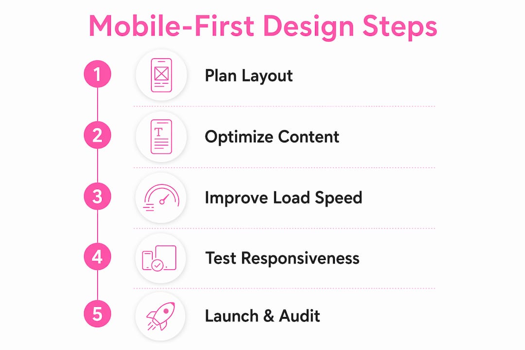
How to implement mobile-first web design: practical steps
Implementing mobile-first design follows a clear sequence. Each step builds on the previous one.
- Start with a 375px prototype. Sketch or wireframe your layout at the smallest common smartphone width before touching code. Every UI element must fit and function at this size. If it does not fit, cut it or simplify it.
- Identify your essential content. List the three to five things a visitor must see or do on each page. Design the mobile layout around those items only. Everything else is a candidate for removal or demotion to a lower scroll position.
- Write mobile-first CSS. Set your base styles for mobile with no media query wrapper. Then use
min-widthbreakpoints, such as@media (min-width: 768px)for tablets and@media (min-width: 1024px)for desktops, to add complexity progressively. - Apply touch target standards. Every button, link, and interactive element needs a minimum 44x44px tap area. Use padding rather than increasing font size to achieve this without breaking your layout.
- Compress and lazy-load images. Use modern formats like WebP, set explicit width and height attributes to prevent layout shift, and defer offscreen images. Image optimization is one of the highest-impact performance improvements available.
- Minimize and defer scripts. Load only the JavaScript your mobile layout requires. Defer or async-load everything else. This directly reduces time to interactive on slower mobile connections.
- Test on real devices. Emulators catch most issues, but real devices reveal touch behavior, font rendering, and scroll performance that simulators miss. Test on at least one Android and one iOS device before launch.
Pro Tip: Avoid the common mistake of treating mobile-first as "mobile only." Mobile-first is a mindset, not a constraint. Your desktop version should be richer, not your mobile version poorer.
A website performance audit after launch will confirm whether your mobile-first implementation is delivering the load times and usability scores you designed for.
Key Takeaways
Mobile-first web design is the most direct method for improving SEO, load speed, and user experience simultaneously, because it aligns your design process with how the majority of users and Google itself interact with your site.
| Point | Details |
|---|---|
| Start at 375px | Design and prototype at the smallest screen size before scaling up to larger layouts. |
Use min-width CSS queries | Build styles up from a mobile base rather than stripping desktop styles down for mobile. |
| Prioritize essential content | Identify the three to five core actions per page and design the mobile layout around those only. |
| Meet touch target standards | Set a minimum 44x44px tap area on all interactive elements to reduce accidental taps. |
| Align with Google's index | Mobile-first design directly supports Google's mobile-first indexing, improving search visibility. |
Why mobile-first is the design decision I stop arguing about
I used to spend time convincing clients that mobile-first was worth the extra planning. I do not do that anymore. The data settled the argument.
What I find more interesting now is how mobile-first exposes weak content strategy faster than any other design constraint. When you are forced to fit a business's core message onto a 375px screen with no sidebar, no hero carousel, and no pop-up, you find out very quickly whether the message is clear. Most of the time, it is not. Mobile-first design is the most honest diagnostic tool I have encountered for identifying what a business actually needs to say versus what it thinks it needs to say.
The other thing I have learned is that the biggest mistake is not skipping mobile-first. It is treating it as a layout exercise rather than a content exercise. Designers who get this right produce sites that are faster, clearer, and more persuasive on every screen. Designers who miss it produce mobile sites that feel like shrunken desktops.
For small business owners, the practical payoff is direct. A mobile-first site loads faster, ranks better, and converts more visitors on the devices they actually use. The connection between site speed and revenue is well documented. Mobile-first is how you build that speed in from the start rather than retrofitting it later.
Mobile devices will keep evolving. Foldables, wearables, and new form factors will keep appearing. The mobile-first mindset, designing for constraints first and enhancing progressively, will remain the right approach regardless of what the hardware looks like.
— Ville
How Verkkosivu builds mobile-first sites for businesses
Verkkosivu specializes in custom websites built mobile-first from day one, with no templates and no shortcuts.

Every site Verkkosivu delivers loads in under one second, is built around your core content and branding, and is fully optimized for Google's mobile-first index. The process covers everything from initial consultation through SEO setup, A/B testing, and ongoing maintenance. With more than 100 completed projects and a perfect 5-star Google rating, Verkkosivu delivers results fast, often within 48 hours. If you need a professional mobile-optimized website that wins customers on every device, Verkkosivu is the direct path to get there.
FAQ
What is mobile-first web design in simple terms?
Mobile-first web design means designing a website for the smallest smartphone screen first, then adding features and layout complexity for larger screens like tablets and desktops.
How is mobile-first different from responsive web design?
Responsive web design describes a flexible layout that adapts to any screen size. Mobile-first is the design strategy of starting that process from the smallest screen rather than the largest.
Why does Google prefer mobile-first websites?
Google uses mobile-first indexing, meaning it crawls and ranks the mobile version of your site. A site with missing or broken content on mobile will rank lower regardless of its desktop quality.
What is the minimum touch target size for mobile design?
The recommended minimum touch target size is 44x44px. Smaller targets cause accidental taps and increase user frustration, which raises bounce rates.
Can a small business benefit from mobile-first design?
A small business benefits directly through faster load times, better search rankings, and higher conversion rates on the devices most customers use to find and evaluate local businesses.