
Hospitality website UX is the deliberate design of a hotel or venue's digital interface to create a seamless guest journey from first visit to booking confirmation. In the industry, this practice is formally called guest-experience design or digital hospitality UX, and it goes well beyond general usability. Hospitality UX focuses on matching guest expectations digitally to replicate the quality of in-person service. Visitors form judgments about hotel websites in around 50 milliseconds, which means your site's visual hierarchy, load speed, and imagery must work instantly. Get this right, and your website converts browsers into booked guests. Get it wrong, and you lose them to an OTA.
What is hospitality website UX and why does it matter?
Hospitality website UX is the structured design of every interaction a potential guest has with your site, from the homepage hero image to the booking confirmation screen. The goal is not just aesthetic appeal. The design goal is converting demand into direct reservations while aligning the digital experience with real-world hospitality standards.
This distinction matters. A general e-commerce site optimizes for speed and clarity. A hospitality site must also evoke emotion, build trust, and match the specific expectations a guest has formed about your property. A boutique hotel in Napa Valley and a business hotel near O'Hare Airport serve different guests with different needs. Their UX must reflect that.
Mobile-first design is not optional in 2026. The majority of travel research and booking now starts on a smartphone. If your site loads slowly or forces users to pinch and zoom, you lose them before they ever see your room photos. Website load speed directly affects both SEO rankings and user retention, making performance a core UX requirement, not a technical afterthought.
Key components of effective hospitality website design
Strong hospitality website design rests on several interconnected elements. Each one serves a specific role in moving a guest from curiosity to commitment.
Visual design and imagery carry the heaviest load early in the journey. High-resolution photos of rooms, amenities, and local surroundings activate guest imagination. Video walkthroughs and 360-degree room views reduce uncertainty, which is one of the primary reasons guests abandon bookings.

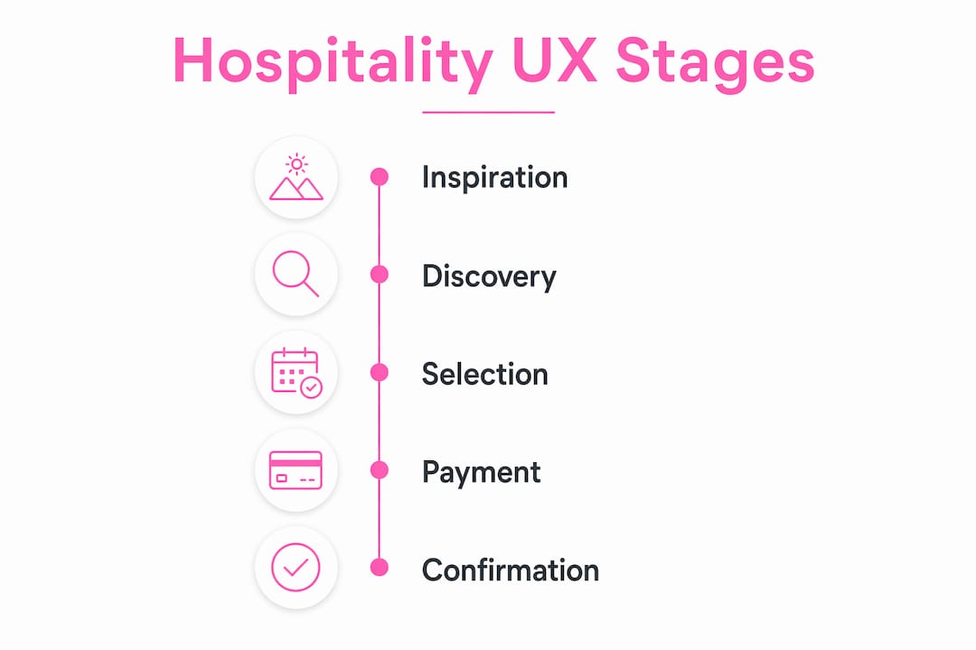
Information architecture must follow the natural guest decision path: inspiration, discovery, selection, and payment. If a guest looking for pet-friendly rooms has to dig through three menu levels to find that information, the site has failed at the discovery stage.
Trust and safety cues include SSL certificates, recognizable payment logos, verified review badges from platforms like TripAdvisor or Google, and clear cancellation policies. These signals reduce perceived risk at the moment a guest is about to enter payment details.
The core UX elements every hospitality site needs include:
- High-quality photo galleries with room-level filtering
- Clear, persistent calls-to-action (CTAs) for booking
- Real-time availability displays integrated with the property management system (PMS)
- Mobile-optimized navigation with thumb-friendly tap targets
- Guest reviews displayed near booking entry points
- Transparent pricing with no hidden fee surprises
Pro Tip: Place your primary booking CTA above the fold on every page, not just the homepage. Guests arrive through blog posts, location pages, and package pages. Every entry point is a potential booking start.
A research study involving 135 users found that perceived personalization is the strongest predictor of positive consumer perception on hospitality platforms, followed by interactivity and trust. That finding should directly shape your UX priorities.
How does the booking engine shape guest trust?
The booking engine is the highest-stakes area of any hospitality site. Pacing must follow a clear search, selection, and payment sequence, with complexity revealed only as the user needs it. This principle is called progressive disclosure, and it prevents guests from feeling overwhelmed mid-transaction.
The most common mistake is treating the booking engine as a third-party tool that lives outside the brand. When a guest clicks "Book Now" and lands on a page with different fonts, colors, and tone, the trust built on the main site evaporates. Brand-aligned design tokens, including button styles, microcopy tone, and typography hierarchy, must carry through from the main site into the booking flow.
The table below shows the difference between a poorly designed and an optimized booking engine experience:
| UX Characteristic | Poor Booking Engine | Optimized Booking Engine |
|---|---|---|
| Visual consistency | Different fonts and colors from main site | Matches brand design tokens throughout |
| Information pacing | All fields shown at once | Progressive disclosure by step |
| Trust signals | No payment logos or security badges | SSL badge, payment logos, cancellation policy visible |
| Mobile experience | Requires horizontal scrolling | Single-column, thumb-friendly layout |
| Error handling | Generic error messages | Specific, helpful inline guidance |
| CTA language | "Submit" or "Continue" | Brand-voice copy like "Reserve Your Stay" |
Whitespace is a functional tool in booking engine design, not a decorative choice. Generous spacing between form fields reduces cognitive load and signals that the process is calm and controlled. Guests who feel in control complete bookings. Guests who feel confused abandon them.
Pro Tip: Audit your booking engine on a real mobile device, not just a browser emulator. Tap every field, check keyboard behavior, and time the full flow from search to confirmation. You will find friction points that desktop testing misses.
Visual and tonal consistency between the hotel site and the booking page strengthens loyalty and reduces price sensitivity. Guests who trust the brand are less likely to abandon to compare OTA prices.
How do you measure and improve hospitality website usability?
Measuring hospitality website usability requires going beyond overall bounce rate. Bounce rate tells you that people left. It does not tell you where in the booking journey they left, or why.
Step-by-step abandonment tracking from search to confirmation identifies the exact design friction points causing drop-off. A spike in exits between the room selection step and the payment step, for example, points to a specific problem: pricing shock, form complexity, or missing trust signals at that stage.
Tracking lead capture metrics like RFP submissions and newsletter signups is equally important. These conversation metrics reflect mid-funnel engagement and show whether your UX nurtures guests who are not ready to book immediately. A site that captures an email today can convert that guest in two weeks.
Tools like Google Analytics 4, Hotjar, and Microsoft Clarity provide session recordings, heatmaps, and funnel reports that reveal real user behavior. Pair these with app analytics platforms to track mobile-specific interaction patterns that desktop analytics often miss.
Best practices for ongoing UX optimization include:
- Run A/B tests on CTA copy, button placement, and hero imagery at least quarterly
- Set up funnel tracking for every step of the booking flow, not just the final conversion
- Review session recordings weekly to spot repeated user confusion patterns
- Survey guests post-booking with a two-question form: what almost stopped you, and what made you confident
- Monitor page load times monthly and flag any page exceeding two seconds as a priority fix
- Analyze device-level conversion rates separately to identify mobile-specific drop-offs
The e-servicescape dimensions of aesthetics, trust, personalization, and interactivity are measurable through user surveys and behavioral data. Tracking these dimensions over time gives you a structured framework for UX improvement rather than relying on gut instinct.
Best practices for hospitality UX design in 2026
Effective UX strategies for lodging properties in 2026 combine technical performance, brand storytelling, and system integration. The following practices reflect current standards for high-converting hospitality sites.
- Build mobile-first, not mobile-adapted. Design the mobile experience first, then scale up to desktop. This forces prioritization of the most critical content and interactions.
- Integrate your booking engine with your PMS and channel manager. Purpose-built hospitality solutions like Cloudbeds connect the website and backend systems for real-time availability sync, reducing the risk of overbooking and guest frustration.
- Use guest imagination-led visuals. Show guests living the experience, not just the room. Photos of guests at the pool, dining, or exploring local attractions convert better than empty room shots.
- Apply e-servicescape principles. Design for aesthetics, trust, personalization, and interactivity as a unified system. Each dimension reinforces the others.
- Write conversational CTAs. Replace "Book Now" with copy that reflects the guest's goal: "Check Availability," "Plan Your Stay," or "See What's Open This Weekend."
- Prioritize load speed as a UX requirement. A speed audit identifies performance bottlenecks that hurt both rankings and user retention. Sub-two-second load times are the current standard for competitive hospitality sites.
- Personalize where the data supports it. Return visitor recognition, geo-targeted content, and dynamic package displays based on browsing history all increase relevance without requiring invasive data collection.
The integration of website with PMS, channel managers, and marketing automation tools is no longer a luxury feature. It is the operational foundation of a hospitality site that performs at scale.
Key takeaways
Hospitality website UX succeeds when guest-expectation matching, brand-aligned booking engine design, and continuous behavioral measurement work together as a single system.
| Point | Details |
|---|---|
| UX starts at first impression | Guests judge your site in 50 milliseconds, so visual hierarchy and load speed are non-negotiable. |
| Booking engine is a brand asset | Apply consistent design tokens, tone, and trust signals from homepage through payment confirmation. |
| Progressive disclosure reduces drop-off | Reveal booking complexity step by step to keep guests calm and in control throughout the flow. |
| Measure beyond bounce rate | Track step-level abandonment and lead capture metrics to find and fix specific conversion leaks. |
| Personalization drives perception | Research shows perceived personalization is the strongest predictor of positive guest behavior on hospitality platforms. |
What i've learned building hospitality sites that actually convert
Most hospitality sites fail at the same point: the handoff from the main site to the booking engine. The visual and tonal break at that moment is where trust collapses. I have seen properties with stunning photography and compelling copy lose guests the instant they click "Book Now" and land on a generic white form that looks like it was built in 2012. The fix is not complicated. It requires treating the booking engine as part of the brand system from day one, not as a vendor-supplied widget you drop in at the end.
The other pattern I see consistently is teams obsessing over homepage bounce rate while ignoring step-level abandonment data in the booking funnel. A 60% bounce rate on the homepage might be fine if the guests who stay are converting at a high rate. A 40% drop-off between room selection and payment is a crisis. Those are two very different problems requiring two very different solutions.
My practical advice: run your full booking flow on three different mobile devices every month. Time it. Note every moment of friction or confusion. Then fix the worst one. Repeat. Iterative improvement based on real device testing outperforms any amount of theoretical UX planning.
Finally, do not sacrifice simplicity for visual ambition. A site that loads in under a second with clean navigation and a clear booking path will outperform a visually spectacular site that takes four seconds to load and buries the booking CTA. Guests are motivated. Your job is to get out of their way.
— Ville
How Verkkosivu builds hospitality sites that perform
If you are responsible for a hospitality property's digital presence, the gap between a site that looks good and one that actually converts is almost always a UX and performance problem.
Verkkosivu builds custom hospitality websites that load in under one second, integrate with booking engines and PMS platforms, and are designed from the ground up around your brand, not a template. Every project includes A/B testing setup, SEO optimization, and ongoing maintenance so your site keeps performing after launch. With more than 100 successful projects and a perfect 5-star rating on Google, Verkkosivu delivers results fast, often within 48 hours. If you want a hospitality site that converts, reach out for a consultation today.
FAQ
What is hospitality website UX in simple terms?
Hospitality website UX is the design of every interaction a potential guest has with your site, from landing page to booking confirmation, with the goal of matching guest expectations and driving direct reservations.
Why does the booking engine matter so much for hotel UX?
The booking engine is where trust converts to revenue. Inconsistent design between the main site and the booking page creates distrust and increases abandonment, so brand alignment across the full flow is critical.
What metrics should i track to improve hospitality website usability?
Track step-level abandonment through the booking funnel, lead capture actions like RFP submissions and newsletter signups, and device-level conversion rates. Overall bounce rate alone does not identify where guests are dropping off.
How does personalization affect hospitality website performance?
A study of 135 users found that perceived personalization is the strongest predictor of positive consumer perception on hospitality platforms, ahead of interactivity and trust signals.
How fast should a hospitality website load?
Sub-two-second load times are the current competitive standard. Pages that exceed two seconds see measurable drops in both search rankings and user retention, making speed a core UX requirement.