
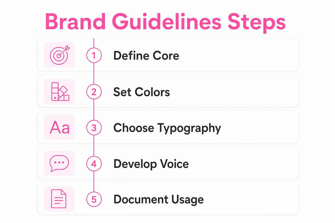
Brand guidelines for startup websites are structured systems of visual and verbal rules that ensure every page of your site communicates the same identity, builds trust, and moves visitors toward action. Most founders treat them as a luxury for later. That is the wrong call. Users form a first impression in about 50 milliseconds, and that judgment is driven by structure and layout, not just color choices. Getting your website design startup brand guidelines right from day one is the difference between a site that earns trust and one that loses visitors before they read a single word. The industry term for this discipline is brand identity systems, and it covers everything from your logo rules to your tone of voice.
What core elements make up effective brand guidelines for startups?
Effective brand guidelines for startups are not a 60-page PDF. They are a focused, usable document that any designer or developer can act on immediately. The goal is clarity, not comprehensiveness.
Visual identity: the non-negotiable foundation
Pre-seed startups should limit brand elements to a distinct name, a simple wordmark logo, a palette of 3–4 colors, and 1–2 typefaces. That constraint is not a budget compromise. It is a discipline that prevents visual noise and keeps your site readable. More colors and fonts do not signal maturity. They signal indecision.
Your color palette needs a primary brand color, one or two supporting colors, and a neutral for backgrounds and text. Document the exact HEX, RGB, and CMYK values. Never leave room for "close enough." Typography works the same way: pick one typeface for headings and one for body text, then document the exact weights, sizes, and line heights for every use case.

Accessible color contrast and typography from day one widen your market reach and cost far less than retrofitting later. WCAG AA compliance is the standard to target. A contrast ratio of at least 4.5:1 for body text is the baseline.
Verbal identity: your cheapest differentiator
A clear verbal voice is the most cost-effective way for a startup to stand out. Your tone of voice, messaging hierarchy, and positioning statement belong in your brand guidelines alongside your logo rules. Write out three to five adjectives that describe how your brand sounds. Then write examples of on-brand and off-brand sentences so any team member can apply the standard without guessing.
Your positioning statement belongs at the top of your guidelines. It answers: who you serve, what you do, and why it matters. Every headline on your website should be traceable back to that statement.
Pro Tip: Write your tone of voice guide with real examples pulled from your own customer conversations. If your customers say "fast" and "no hassle," those words belong in your copy, not "agile" and "frictionless."
UI structure: layout grids and reusable components
A consistent visual framework with defined typography, color hierarchy, spacing, and reusable UI components strengthens brand identity and user trust. Document your grid system, your spacing scale (8px increments work well), and your core components: buttons, cards, form fields, and navigation patterns. This is the Minimum Viable Brand concept applied to UI: build only what you need now, but build it in a way that scales.
- Logo usage rules: Clear space, minimum size, approved color variations, and prohibited uses.
- Color palette: Primary, secondary, and neutral colors with exact values for digital and print.
- Typography: Typeface names, weights, sizes, and line heights for H1 through body text.
- Spacing and grid: Base unit, column count, gutter width, and margin rules.
- Tone of voice: Three to five descriptors, on-brand examples, and off-brand examples.
- UI components: Button styles, link styles, form fields, and icon usage.
How do website design principles integrate with startup brand guidelines?
Website design principles like visual hierarchy and contrast derive from cognitive science and Gestalt psychology. Ignoring them reduces conversion and user satisfaction in measurable ways. Your brand guidelines must encode these principles, not just describe your logo.
Here is how the integration works in practice:
- Visual hierarchy: Your brand's typographic scale directly controls hierarchy. A founder who documents H1 at 48px bold and H2 at 32px medium has already made a hierarchy decision. Make it intentional by mapping each type size to a specific content role.
- Contrast: Your color palette must be tested for contrast before it is finalized. A brand color that looks great on a white background may fail on your dark-mode layout. Test every combination.
- Consistency: Reusable UI components in your guidelines eliminate the inconsistency that erodes trust. When every button looks the same and every card follows the same spacing, visitors process your site faster and trust it more.
- Purposeful simplicity: Decision fatigue is real. A page with three competing calls to action converts worse than a page with one. Your brand guidelines should specify the primary CTA style and reserve it for one action per page.
- Performance as a brand signal: A site that loads slowly signals unreliability. Brand trust is not just visual. Verkkosivu builds every site to load in under one second, which directly supports the trust your brand guidelines are designed to create.
"Brand guidelines are not just visual rules. They encompass tone of voice, values, and user experience to create a complete brand representation online." — IxDF, What are Brand Guidelines?
The practical takeaway: write your brand guidelines with a web designer in mind. Every rule you document should be directly translatable into a CSS variable, a component spec, or a content brief. Abstract principles that cannot be implemented are not guidelines. They are aspirations.
What tools and strategies should startups use to build brand guidelines?
The right tools make brand guidelines usable, not just readable. The wrong tools turn them into a document nobody opens.
| Tool | Best use | Cost tier |
|---|---|---|
| Figma | Logo layout, UI components, style assets, and team sharing | Free tier available |
| Adobe Illustrator | Vector logo creation and export | Paid subscription |
| Notion or Confluence | Written documentation and team access | Free tier available |
| Google Fonts | Accessible web typography selection | Free |
Figma and Adobe Illustrator are the standard tools for creating and maintaining practical brand guidelines without large resource expenditure. Figma is the default for UI component libraries and sharing assets with developers. Adobe Illustrator handles vector logo files that scale to any size without quality loss.
The process matters as much as the tool. Build your brand guidelines as a living document, not a finished artifact. Start with a single Figma file that contains your color styles, text styles, and core components. Link that file to your Notion or Confluence documentation. Any team member can access both without asking you for the latest version.
Regular updates and collaborative documentation keep brand guidelines relevant and effectively communicated to all team members. Schedule a quarterly review. Check whether your guidelines still reflect how your product has evolved. Update examples when your messaging shifts.
Pro Tip: Create a "brand decisions log" in your documentation. Every time you make a deliberate exception to your guidelines, record why. This prevents exceptions from becoming the new standard by accident.
Balancing minimalism with scalability is the core challenge at the early stage. Build only the components you are actively using. A 200-component library that nobody maintains is worse than a 20-component library that is always current.
How to implement brand guidelines with your web designer or developer
Translating brand guidelines into a live website requires clear communication from the start. A well-written brief saves weeks of revision cycles.
- Send the Figma file, not a PDF. Developers can inspect exact values from Figma. A PDF forces them to guess or ask.
- Specify deliverables in brand terms. Instead of "make it look professional," write "use the primary blue (#1A3CFF) for all primary buttons and the neutral gray (#F5F5F5) for all section backgrounds."
- Define what is fixed and what is flexible. Tell your designer which elements are non-negotiable (logo placement, primary color) and which have room for interpretation (image style, illustration approach).
- Include your tone of voice guide in the brief. Designers write placeholder copy. If your tone guide is in the brief, that copy will reflect your brand rather than generic filler.
- Use a website readiness checklist before launch. Check that every page applies the brand guidelines consistently before you go live.
Brand dilution during development is a real risk. It happens when a developer makes a quick decision without the guidelines in front of them. The fix is not more oversight. It is better documentation. If your guidelines are clear enough that a developer can answer their own question by reading them, you have done the job right.
Aligning brand guidelines with SEO is an underrated benefit. Consistent heading hierarchy, clear page titles, and structured content all serve both brand clarity and search engine indexing. A site built with strong web design investment principles from the start performs better in both areas. When you communicate your vision clearly to your designer, the result is a site that ranks and converts.
Key Takeaways
Effective website design startup brand guidelines combine a focused visual system, a defined verbal voice, and documented UI rules that any designer can implement immediately.
| Point | Details |
|---|---|
| Limit early brand elements | Use 3–4 colors and 1–2 typefaces to avoid visual noise before product-market fit. |
| Verbal identity is foundational | Document your tone of voice with real examples to ensure consistent copy across every page. |
| Design principles must be encoded | Map cognitive science principles like visual hierarchy and contrast directly into your guidelines. |
| Use Figma as your single source | Store color styles, text styles, and UI components in one shared Figma file for team access. |
| Brief designers with specifics | Share exact HEX values, component specs, and tone examples, not abstract descriptions. |
Why I think most startup founders get brand guidelines backwards
Most founders I talk to treat brand guidelines as something they will create after they have a designer. That is backwards. The guidelines should come first, even if they are rough. A one-page document with your logo, your three brand colors, your two typefaces, and five sentences about your tone of voice is enough to brief a designer and get a consistent result.
The verbal identity piece is where I see the biggest gap. Founders spend hours debating logo colors and almost no time writing down how their brand sounds. Yet a clear verbal voice is the cheapest differentiator available to an early-stage startup. It costs nothing to write. It pays off every time someone reads your homepage, your email, or your social post and recognizes the same voice.
The other mistake is treating brand guidelines as a finished document. They are not. Your brand will evolve as you learn more about your customers. The goal is not perfection. The goal is a living document that keeps your site consistent while you iterate. I have seen startups with a two-page brand guide outperform ones with a 40-page brand book, simply because the two-page version was actually used.
Prioritize user experience in every brand decision. If a brand rule makes your site harder to use, the rule is wrong. Brand consistency and usability are not in conflict. When you build them together from the start, the result is a site that feels right to visitors before they can explain why.
— Ville
How Verkkosivu builds brand-aligned websites for startups
Verkkosivu specializes in custom startup websites built without templates, each one tailored to your specific brand guidelines and loaded in under one second. Every project starts with a consultation that translates your brand documentation into a functional design brief. Verkkosivu's process covers SEO optimization, A/B testing, and ongoing maintenance, so your site stays aligned with your brand as it evolves. With more than 100 successful projects and a perfect 5-star rating on Google, Verkkosivu delivers results fast, often within 48 hours, with no hidden costs. If your startup needs a website that reflects your brand identity from day one, Verkkosivu is the place to start.
FAQ
What are website design startup brand guidelines?
Website design startup brand guidelines are documented rules covering your logo, color palette, typography, tone of voice, and UI components. They ensure every page of your site communicates a consistent brand identity.
How many colors should a startup use in its brand guidelines?
Pre-seed startups should use 3–4 colors in their brand palette. More colors add visual noise and slow down design decisions before you have reached product-market fit.
Why does verbal identity belong in brand guidelines?
Verbal voice is a cost-effective differentiator that shapes how every headline, button, and email sounds. Without documented tone of voice, copy becomes inconsistent across pages and team members.
What tool is best for creating startup brand guidelines?
Figma is the standard tool for building and sharing brand guidelines. It stores color styles, text styles, and UI components in one file that designers and developers can inspect directly.
How often should a startup update its brand guidelines?
Brand guidelines require regular updates to stay relevant as the product and messaging evolve. A quarterly review is a practical cadence for early-stage startups.