
Startup landing page conversion optimization is the process of refining your page design, copy, and interactive elements to increase the percentage of visitors who take a desired action. Median conversion rates for startup landing pages sit between 3.8% and 6.6%, while top performers exceed 11%. That gap is not luck. It comes from applying specific techniques: a clear value proposition, a single call-to-action (CTA), short forms, and social proof placed where visitors actually look. The industry term for this practice is conversion rate optimization, or CRO. This guide covers the highest-impact CRO moves for startups in 2026.
What are the essential elements to startup landing page conversion optimize?
A high-converting startup landing page is built around one goal: getting a specific visitor to take one specific action. Every element on the page either supports that goal or gets in the way.
The headline is the most critical element. It must match the exact language of the ad or link that brought the visitor to the page. Message match between your ad copy and your landing page headline is the single most effective way to protect your ad budget and improve conversion efficiency. When visitors see different language on the page than what they clicked, they leave.

Visitors spend about 80% of their time viewing content above the fold. That means your value proposition, your CTA, and at least one piece of social proof must all be visible before anyone scrolls. Placing a customer logo strip or a short testimonial directly beneath your headline costs nothing and builds trust instantly.
Here are the core elements every high-converting startup landing page needs:
- Benefit-focused headline that mirrors your ad copy exactly
- Single, prominent CTA above the fold with no competing links
- Social proof (testimonials, logos, review counts) placed near the CTA
- Minimal copy written at a 5th to 7th grade reading level
- No navigation menu or footer links that pull visitors away from the page
- One strong visual that reinforces the offer, not decorates the page
Pro Tip: Remove your site's main navigation from the landing page entirely. Treating a landing page like a mini-homepage by keeping the nav bar is one of the fastest ways to lose conversions.
How can startups optimize form design to boost conversion rates?
Form design is where most startups quietly lose conversions without realizing it. The relationship between field count and conversion rate is direct and measurable.
Single-field forms convert at 13.4%, while nine-field forms drop to just 3.6%. Reducing form fields from 11 to 4 can increase conversions by up to 160%. That is not a marginal improvement. It is a structural change in how many leads you capture from the same traffic.
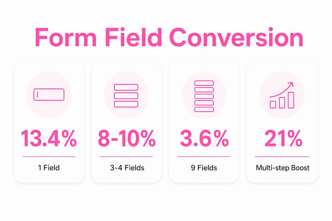
The table below shows how field count affects conversion performance:
| Number of fields | Approximate conversion rate |
|---|---|
| 1 field | 13.4% |
| 3–4 fields | 8%–10% |
| 5–6 fields | 6%–7% |
| 9+ fields | 3.6% |
For most B2B startups, 3–4 fields is the right balance between lead quality and volume. Ask for name, email, company name, and one qualifying question. Skip phone numbers and job titles unless your sales team genuinely uses them to route leads.
Multi-step forms increase conversion rates by 21% compared to the same number of fields on a single page. The reason is cognitive load. When a visitor sees one question at a time, the form feels shorter and less demanding. Progressive disclosure, showing only the next relevant question based on a previous answer, reduces friction further.
Pro Tip: Start your multi-step form with the easiest question, such as "What best describes your role?" This micro-commitment gets visitors moving through the form and dramatically reduces abandonment before they reach the email field.
Which technical and design factors most influence startup landing page conversions?
Page speed is not a nice-to-have. A one-second delay in load time decreases conversion rates by about 7%. For a startup spending money on paid traffic, that is a direct tax on every dollar you spend.
The fastest pages share a short list of technical practices:
- Compress all images using formats like WebP before uploading
- Use a CDN (content delivery network) to serve assets from servers close to your visitors
- Lazy-load images below the fold so the visible page loads first
- Minify CSS and JavaScript files to reduce file size
- Defer non-critical scripts so they do not block the initial page render
Mobile design deserves equal attention. More than half of paid traffic now arrives on mobile devices. A sticky CTA button that stays visible as visitors scroll keeps the conversion action one tap away at all times. Fonts should be at least 16px, buttons at least 44px tall, and forms should auto-trigger the correct keyboard type (numeric for phone fields, email for address fields).
Visual hierarchy guides the eye from headline to supporting copy to CTA without the visitor having to think. Use size, contrast, and white space to create a clear reading path. A cluttered page with three competing visual focal points performs worse than a simple page with one clear direction, even if the simple page looks less impressive.
Verkkosivu builds every landing page to load in under one second, which directly protects the conversion impact of speed for startups running paid campaigns.
How does continuous A/B testing drive steady landing page improvement?
Landing page A/B testing is the practice of showing two versions of a page to different visitors simultaneously and measuring which version produces more conversions. It is the only reliable way to know whether a change actually helps.
The rules for effective testing are straightforward:
- Test one variable at a time. Change the headline OR the CTA text, not both. Testing multiple changes at once makes it impossible to know which change caused the result.
- Start with high-impact elements. Headlines and CTA text affect every visitor. Test those before you test button colors or image placement.
- Run tests until you reach statistical significance. Ending a test after 50 visitors produces unreliable data. Most tests need at least 300–500 conversions per variant to be trustworthy.
- Track the right metrics. Conversion rate is the primary metric. Also track bounce rate and time on page to understand visitor behavior.
- Document every test. Keep a log of what you tested, what the result was, and what you decided. Institutional memory prevents you from repeating failed experiments.
Continuous testing starting with headlines and CTAs, then progressively refining layout and visuals, is the proven sequence for startups. Tools like Google Optimize, VWO, and Optimizely all support this workflow.
Personalized CTAs convert 202% better than generic ones by matching visitor intent. Audience segmentation, showing different headlines or offers to visitors from different traffic sources, is the next level of this practice. A visitor from a Facebook ad about pricing responds differently than one from a Google search for a specific feature.
Pro Tip: Build a simple test calendar. Schedule one test per month minimum. Startups that run 12 tests per year consistently outperform those that redesign their page once and leave it alone.
What common startup landing page mistakes hurt conversion?
Most startup landing page failures come from the same short list of errors. Recognizing them is the first step to fixing them.
- Multiple CTAs or navigation links. Multiple CTAs reduce conversion by 15%–30% by splitting visitor attention. Pick one action and remove everything else.
- Vague or feature-focused copy. Visitors want to know what the product does for them, not how it works. "Save 5 hours a week on reporting" outperforms "Advanced analytics dashboard" every time.
- Message mismatch. When your ad promises a free trial and your landing page talks about pricing, visitors feel misled. They leave. Aligning ad copy with page headline is the fastest fix for wasted ad spend.
- Overloaded forms. Asking for 8 fields when you only need 3 is a conversion tax you impose on yourself. Audit every field and delete any that your team does not act on within 48 hours of receiving it.
- Ignoring mobile experience. A page that looks great on desktop but requires pinch-zooming on mobile loses the majority of your paid traffic before it even reads your headline.
- No iteration cycle. Launching a page and leaving it unchanged for six months is not a strategy. The role of landing page optimization is ongoing, not a one-time task.
Key Takeaways
Startup landing page conversion optimization delivers the highest returns when you focus on message match, minimal form fields, page speed, and a single CTA tested continuously.
| Point | Details |
|---|---|
| Message match is non-negotiable | Align your ad copy and headline exactly to prevent visitors from bouncing immediately. |
| Fewer form fields convert more | Reducing fields from 9 to 3–4 can more than double your form conversion rate. |
| Speed directly affects revenue | A one-second load delay cuts conversions by about 7%, making speed a direct business cost. |
| Single CTA outperforms multiple | Multiple CTAs reduce conversions by 15%–30%; one focused action keeps visitors on track. |
| Test one variable at a time | Changing one element per test cycle is the only way to know what actually drives improvement. |
What I've learned from watching startups get this wrong
Most startup founders treat their landing page like a finished product. They spend weeks on design, launch it, and then move on. That is the wrong mental model entirely.
A landing page is an experiment in progress. The version you launch is your hypothesis, not your answer. Every week it runs without a test cycle is a week of data you are not collecting. I have seen startups with genuinely strong products lose to competitors with weaker products simply because the competitor tested their page relentlessly and the startup did not.
The other pattern I see constantly is over-engineering the form. Founders want to qualify leads before they talk to them, so they add field after field until the form looks like a job application. The data is unambiguous: shorter forms win. Qualify leads in the sales call, not on the page.
The highest-impact move for most early-stage startups is not a redesign. It is fixing message match and cutting the form to three fields. Those two changes alone, done in a week, routinely outperform a full redesign that takes two months.
Start with what you can measure. Fix the obvious errors first. Then test your way to the top of the conversion range.
— Ville
How Verkkosivu helps startups build pages that convert
Startups that need results fast cannot afford to spend months on a landing page that might not work.
Verkkosivu builds custom landing pages that load in under one second, are built without templates, and are tailored to your specific offer and audience. Every project includes SEO setup, mobile optimization, and A/B testing support from day one. With more than 100 successful projects and a perfect 5-star rating on Google, Verkkosivu delivers pages within 48 hours, with no hidden costs. If you are a startup that needs a high-performing page without the back-and-forth of a long agency process, Verkkosivu is built for exactly that situation. See what a fast, conversion-focused site looks like for your business.
FAQ
What is a good conversion rate for a startup landing page?
Median conversion rates for startup landing pages range from 3.8% to 6.6%. Top-performing pages focused on high-intent traffic exceed 11%.
How many form fields should a startup landing page have?
Three to four fields is the recommended range for most startups. Single-field forms convert at 13.4%, while nine-field forms drop to 3.6%, so keep forms as short as your sales process allows.
What should I test first on my landing page?
Test your headline and CTA text before anything else. Continuous testing starting with headlines and CTAs produces the fastest and most measurable conversion gains.
Why do multiple CTAs hurt conversions?
Multiple CTAs split visitor attention and create decision paralysis. Multiple CTAs reduce conversion by 15%–30% compared to a single focused action.
How does page speed affect landing page conversions?
A one-second delay in load time reduces conversions by about 7%. For startups running paid ads, slow pages directly increase cost per acquisition.